Understanding the 3 Second Rule
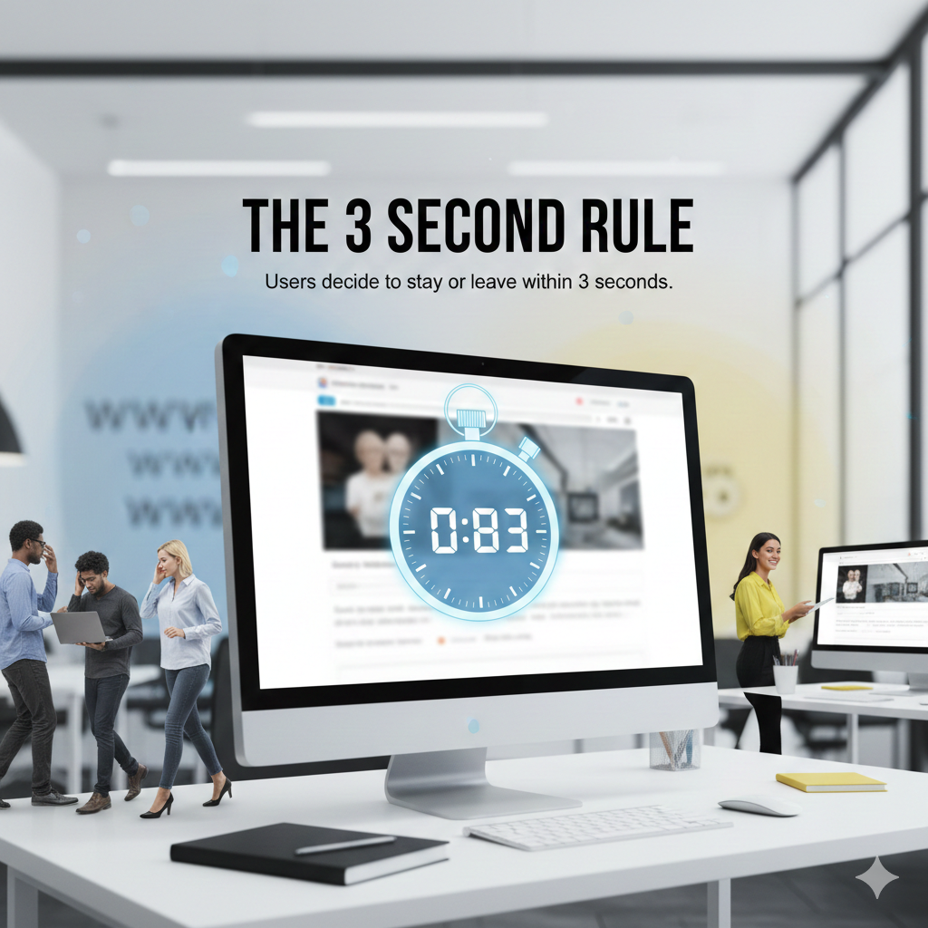
You’ve got three seconds. That’s it. Three seconds to capture your visitor’s attention, communicate your value, and convince them to stay on your website. This is the essence of the 3 second rule in web design—a principle that recognizes the incredibly short window you have to make a positive first impression on potential customers.
In today’s fast-paced digital world, user patience is thinner than ever. When someone clicks on your website, they’re making split-second judgments about whether it’s worth their time. Within those crucial first three seconds, visitors are evaluating your site’s credibility, relevance, and usability. If your website fails to deliver during this critical window, they’ll hit the back button and move on to a competitor.
The 3 second rule isn’t just about website loading time, though that’s certainly part of it. It encompasses everything from visual hierarchy to content readability, from design simplicity to call to action visibility. Every element on your page needs to work together to create an immediate, positive impression that encourages user engagement.
Why the First Impression Is Everything
Research shows that users form opinions about your website in as little as 50 milliseconds. That first impression is heavily influenced by visual design, but it goes deeper than aesthetics. Your visitors are unconsciously asking themselves: “Does this site look professional? Can I find what I need? Is this worth my time?”
A strong first impression builds trust instantly. When visitors land on a well-designed, fast-loading page with clear navigation clarity, they’re more likely to explore further, engage with your content, and ultimately convert into customers. Poor first impressions, on the other hand, can damage your brand reputation and tank your conversion rate before visitors even scroll down.
Key Elements of the 3 Second Rule
Website Loading Time
Speed matters tremendously. If your site takes longer than three seconds to load, you’re already losing visitors. Studies show that 53% of mobile users abandon sites that take longer than three seconds to load. Every additional second of delay can decrease your conversion rate by up to 7%.
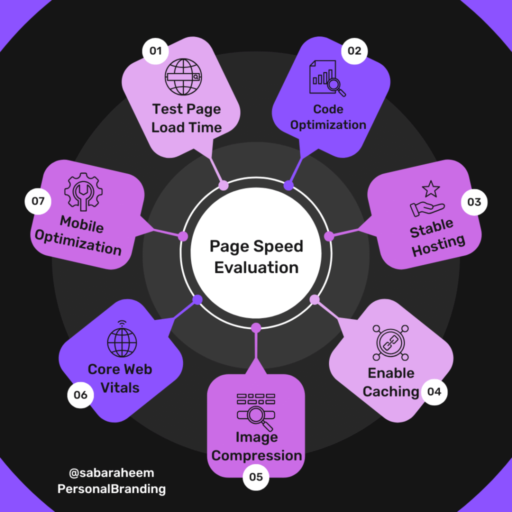
Optimize your images, minimize code, use browser caching, and consider a content delivery network (CDN) to ensure your pages load lightning fast. Website loading time is the foundation of the 3 second rule—if visitors can’t see your content quickly, nothing else matters.
Visual Hierarchy
Within those three seconds, visitors should immediately understand what your website is about and where to look first. Visual hierarchy uses size, color, contrast, and positioning to guide the eye to the most important elements first. Your headline should be prominent, your key message clear, and your call to action visible without scrolling.
Effective visual hierarchy reduces cognitive load and makes information processing effortless. When visitors can instantly grasp your site’s purpose and structure, they’re more likely to stay and engage.
Design Simplicity
Cluttered, complex designs confuse visitors and violate the 3 second rule. Design simplicity means removing unnecessary elements, using ample white space, and focusing on what truly matters. A clean, minimalist design communicates professionalism and makes it easier for visitors to focus on your core message.
Simple doesn’t mean boring—it means intentional. Every element should have a purpose. If it doesn’t support your goals or improve user experience, remove it.
Navigation Clarity
Can visitors figure out where to go next within three seconds? Your navigation should be intuitive, with clear labels that describe exactly what users will find when they click. Avoid clever, ambiguous menu items in favor of straightforward language.
Navigation clarity also means limiting choices. Too many options create decision paralysis. Focus on your most important pages and make them prominently accessible.
Content Readability
Your content should be scannable and easy to digest at a glance. Use short paragraphs, bullet points, subheadings, and plenty of white space. Choose legible fonts and ensure sufficient contrast between text and background. Content readability isn’t about dumbing down your message—it’s about respecting your visitors’ time and attention.
Within three seconds, visitors should be able to scan your page and understand your key value proposition, even if they don’t read every word.
Call to Action Visibility
Your call to action (CTA) should be obvious within the first three seconds. Whether it’s “Shop Now,” “Get Started,” or “Contact Us,” visitors should know exactly what action you want them to take. Use contrasting colors, strategic placement, and clear, action-oriented language to make your CTA impossible to miss.
A visible, compelling CTA directly impacts your conversion rate by reducing friction and making the next step obvious.
The 3 Second Rule and User Engagement
User engagement is the ultimate goal of following the 3-second rule. When you capture attention quickly and create a positive first impression, visitors are more likely to:
- Spend more time on your site
- Visit multiple pages
- Interact with your content
- Sign up for newsletters
- Make purchases
- Return in the future
Each second you hold a visitor’s attention increases the likelihood they’ll engage with your brand. The 3 second rule is your entry ticket to deeper user engagement—fail at those first three seconds, and you never get the opportunity to build a relationship.
How the 3 Second Rule Impacts Conversion Rate
Your conversion rate is directly tied to how well you execute the 3 second rule. Think about it: if 70% of visitors leave within three seconds because of slow loading times or confusing design, you’ve lost 70% of your potential conversions before they even see your offer.
By optimizing for those critical first three seconds, you keep more visitors on your site, giving them the chance to move through your conversion funnel. Every improvement in first impression quality, website loading time, and navigation clarity contributes to higher conversion rates.
Implementing the 3 Second Rule: Best Practices
Test Your Loading Speed
Use tools like Google PageSpeed Insights, GTmetrix, or Pingdom to measure your website loading time. Aim for under three seconds on both desktop and mobile. Optimize images, enable compression, minimize HTTP requests, and leverage browser caching to improve speed.
Create Clear Visual Hierarchy
Make your headline the largest element above the fold. Use contrasting colors for your call to action. Ensure your most important content is visible without scrolling. Guide the eye naturally through your page with strategic use of size, color, and placement.
Simplify Your Design
Remove unnecessary elements. Reduce the number of fonts, colors, and competing visual elements. Use white space generously. Ask yourself if each element serves a clear purpose—if not, eliminate it.
Improve Navigation
Keep your main navigation to 5-7 items maximum. Use clear, descriptive labels. Make your logo clickable to return home. Consider a sticky navigation menu that remains visible as users scroll.
Enhance Readability
Use short paragraphs (2-3 sentences maximum). Break up text with subheadings, bullet points, and images. Choose readable fonts sized at least 16px. Ensure strong contrast between text and background.
Make CTAs Stand Out
Use high-contrast colors for buttons. Position your primary CTA above the fold. Use action verbs that clearly communicate what happens next. Make buttons large enough to click easily, especially on mobile.
Common Mistakes That Violate the 3 Second Rule
| Mistake | Impact | Solution |
|---|---|---|
| Slow loading pages | Immediate abandonment, lost traffic | Optimize images, use CDN, minimize code |
| Cluttered homepage | Confusion, cognitive overload | Simplify design, focus on key message |
| Hidden navigation | Frustration, inability to find information | Make menu clear and visible |
| Vague headlines | Unclear value proposition | Use specific, benefit-driven headlines |
| Invisible CTAs | Missed conversion opportunities | Use contrasting colors and prominent placement |
| Auto-play videos/audio | Annoyance, immediate exit | Allow users to control media playback |
| Too much text above fold | Overwhelming, difficult to scan | Break text into digestible chunks |
| Poor mobile optimization | High bounce rate on mobile devices | Implement responsive design |
Frequently Asked Questions
Q: Does the 3 second rule apply to all types of websites?
A: Yes, the 3 second rule applies universally, though the specific implementation may vary. E-commerce sites need clear product visibility and easy navigation, while blogs should prioritize content readability and engaging headlines. Regardless of your website type, you still have only three seconds to capture attention and encourage visitors to stay.
Q: Is three seconds really enough time for users to evaluate a website?
A: Absolutely. Research shows users form first impressions in 50 milliseconds and make stay-or-leave decisions within 3-5 seconds. While they’re not consciously analyzing every detail, their brains are rapidly processing visual cues, credibility signals, and relevance indicators. This is why optimizing for those critical first seconds is so important.
Q: What’s more important: loading speed or visual design?
A: Both are crucial and interconnected. If your site doesn’t load within three seconds, visitors never see your beautiful design. However, a fast-loading site with poor visual hierarchy or confusing navigation will also lose visitors quickly. The best approach is to optimize both—ensure fast website loading time AND create an effective visual design.
Q: How do I measure if my site passes the 3 second rule test?
A: Use analytics to track your bounce rate—if more than 50-60% of visitors leave immediately, you likely have a problem. Tools like Hotjar or Crazy Egg show heatmaps revealing where users click and how far they scroll. Run speed tests with Google PageSpeed Insights. Better yet, do user testing: show your homepage to people unfamiliar with your site and ask them to explain what your site does within three seconds.
Q: Can I test my website’s first impression objectively?
A: Conduct a “5-second test” where you show your homepage to test users for five seconds, then ask them what they remember and what the site is about. Their answers reveal how effective your first impression is. You can also use tools like UsabilityHub or ask colleagues unfamiliar with your site for honest feedback.
Q: Does the 3 second rule apply to mobile devices differently?
A: Mobile users are even less patient than desktop users. Mobile user patience is especially limited because they’re often on-the-go, dealing with slower connections, and using smaller screens. Your mobile site needs to load even faster (aim for under 2 seconds), have larger tap targets, simplified navigation, and ultra-clear visual hierarchy. Mobile-first design is essential for meeting the 3 second rule.
Q: What if my product or service is complex and needs explanation?
A: Even complex offerings need a simple entry point. Use your first three seconds to communicate your core value in simple terms—what problem you solve and for whom. You can provide detailed explanations deeper in the site, but your homepage needs a clear, compelling headline that instantly communicates relevance. Think “CRM software for small businesses” rather than “Revolutionary cloud-based customer relationship management platform utilizing AI-driven analytics.”
Q: How often should I re-evaluate my site against the 3 second rule?
A: Review your site quarterly at minimum, and whenever you see changes in bounce rate or conversion rate. User expectations and design trends evolve, so what worked last year might feel outdated now. Regular testing, monitoring loading times, and staying current with web design best practices ensures you continue meeting the 3 second rule.
Conclusion: Win in the First Three Seconds
The 3 second rule in web design isn’t just a guideline—it’s a reality of modern user behavior. With countless options competing for attention, visitors make near-instantaneous decisions about whether your website deserves their time. By focusing on fast website loading time, clear visual hierarchy, design simplicity, navigation clarity, content readability, and call to action visibility, you can create that crucial positive first impression.
Remember, you can’t re-make a first impression. Those three seconds determine whether visitors bounce away or become engaged users who explore your content and convert into customers. Every improvement you make to your site’s speed, clarity, and usability directly impacts your conversion rate and bottom line.
Test your website today. Load it on different devices. Ask someone unfamiliar with your business to visit and tell you what they think in three seconds. The answers might surprise you—and give you clear direction for improvement. In web design, three seconds isn’t just a rule. It’s your opportunity to succeed or your window to lose. Make those three seconds count.


Leave a Reply